
Last month I spent a creatively energising week on a residency with Full Grown (Gavin… Read More
Last month I spent a creatively energising week on a residency with Full Grown (Gavin… Read More

Your invitation to visit my studio At the end of May I’m taking part in… Read More

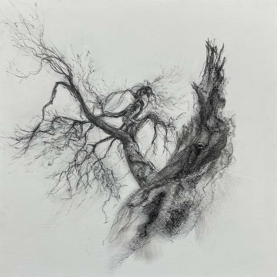
What began as rough drawings on freezing winter days progressed through materials research with ground… Read More

Making monoprints in charcoal Over the last year or so I’ve been using my large… Read More

Charcoal Printmaking Project Charcoal printmaking is my new thing. I always seem to need a… Read More
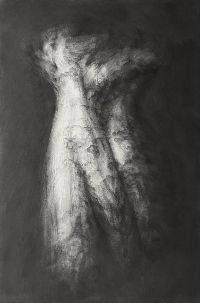
A moment of poise We can’t quite work out what we are seeing: is it… Read More
Thinking about ‘Reunion’ I generally prefer to leave room for other people to make their… Read More

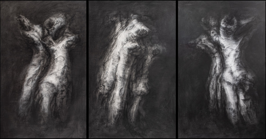
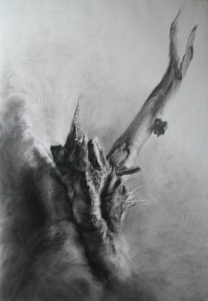
Where the ‘Ghosts’ came from They began with a strange moment of recognition; an ailing… Read More

Find more on the residency in this blog post.
I spent the first week in May on a residency at The Old Lock Up… Read More
A new arrival They arrived unexpectedly, a procession of strange tree forms with wispy branches… Read More

How a new series of artwork began Isn’t it interesting how one set of experiences… Read More
In the political and social chaos that infected this autumn, I found myself seeking some… Read More
Sculptural drawing and drawing sculpture It’s been said that I draw in a very sculptural… Read More
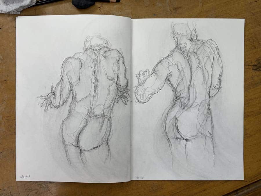
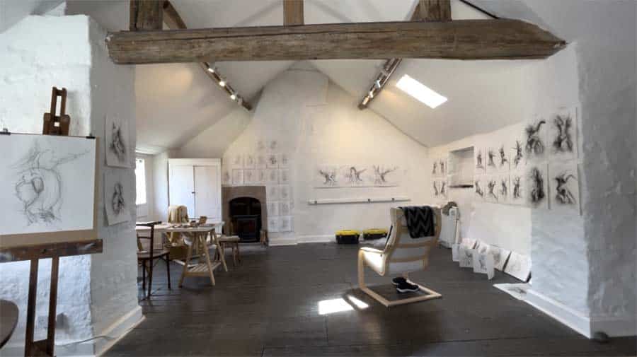
My mission this month has been to refresh my studio practice with some intensive drawing,… Read More