Drawing directly from life is a core element of my practice and spending time amongst the trees is essential in feeding my creative practice. Of course being in the woods is also a very grounding and restorative thing to do, with or without a sketchbook.
For me drawing is a way of really connecting with the trees, a process of intense looking and considered dialogue with a living thing. I’m always trying to capture the aliveness of the tree I’m drawing, getting a sense of its movement and flow, its character. I approach it like I’m having a conversation, asking questions about its form, why it grew that way, what has influenced it. The finished drawings become a record of that conversation.
Given how much enjoyment and challenge I get from this process, it seemed only natural to start sharing the experience with other tree lovers this autumn through my Woodland Drawing workshops.
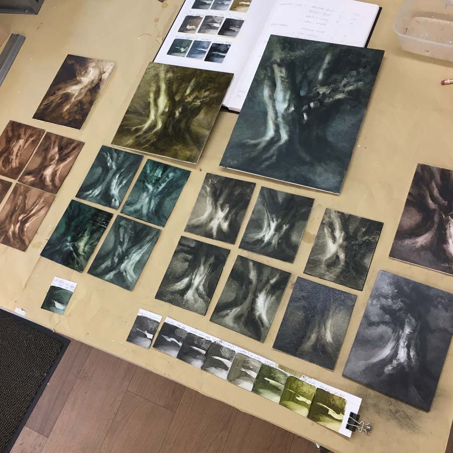
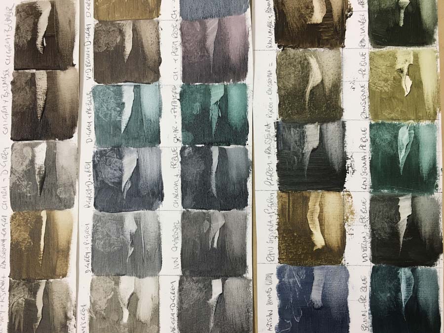
It’s been an intense few months in my studio, while I’ve been immersed in developing a new way of working in oil paint. New materials require trials and experiments, so I’ve been doing my best impression of a methodical person, testing all the variables of substrates, grounds, paint brands, mediums, mark-making tools and finishes. The time (and money) invested is now paying off and I’ve found combinations which are enabling me to say what I want to in paint. I now know what I like, don’t like and hate with a passion – this will make it so much easier to express myself in new but hopefully still familiar ways.
Colour choices
I’ve bought a lot of new paints and tried a LOT of combinations. Earthy colours and natural pigments like slate or oxides have appealed most to me from these trials. I’ve been particularly excited to discover a ready-made oil paint using charcoal as the pigment, since I realised making my own in any amounts would take more time than I’d like.
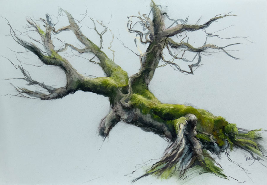
I’ve decided to restrict the works to an almost monochrome palette, using colours which suggest ‘beechness’ but don’t attempt to depict it. I plan to use subtle glazes to deepen the colours and enhance their glow.
Reductive painting
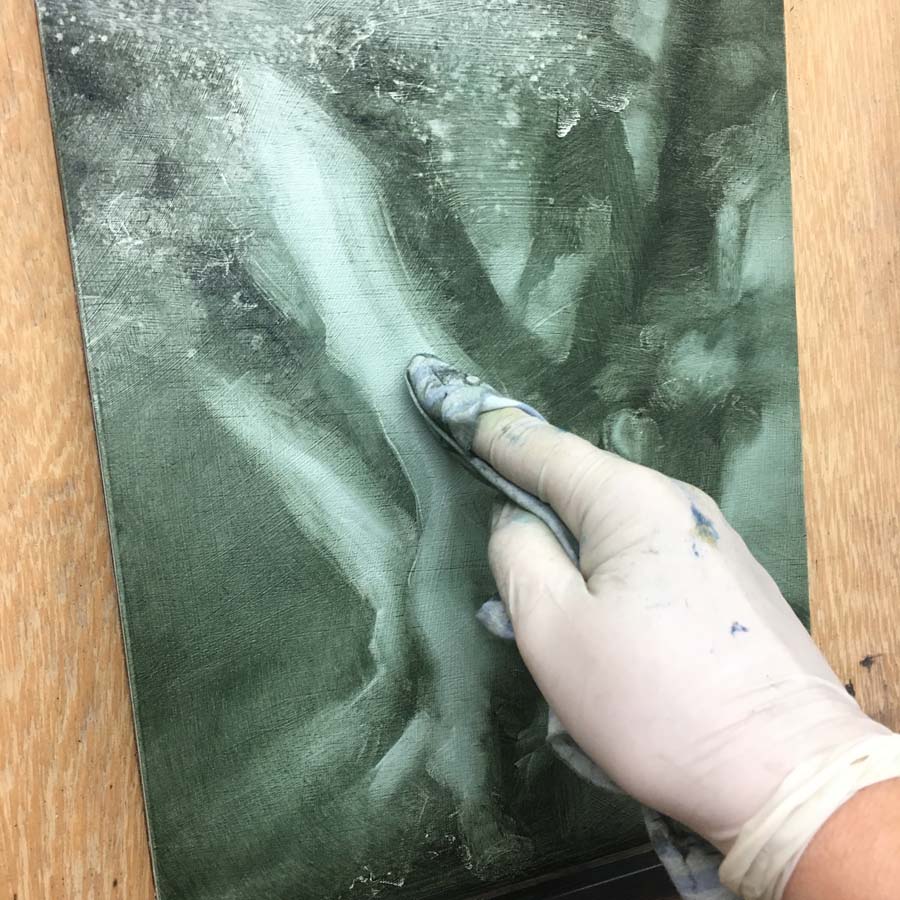
I approach my charcoal works as if I’m drawing with light, so it made complete sense to work with paint in the same way. Reductive painting simply means removing paint to create lights rather than adding it to create darks – it’s a very tonal technique with a broad range of mark-making possibilities.
It also means I get to paint with my fingers, so I’m still in that particular comfort zone! Guiding me on the studio wall are images of lithographs by Eugène Carrière, a master of ethereal monochrome work and images by early Pictorialist photographers which remind me to keep those tones simple whenever I get too wrapped up in details.
Here’s what my reductive painting technique looks like in action…
and here’s a quick view of the paintings drying between layers…
The arrival of a title
As they’ve been gathering in the studio, the word ‘Grounded’ has linked itself with this new series – in my mind it seems to sum up both the qualities of the trees they are inspired by and my reaction to being in their presence.
These old veterans are relics of a former landscape in an ancient woodland at Kinclaven, Perthshire. Massive, stoic and stunningly beautiful, they’ve given me enough ideas to keep me working through whatever the winter brings.
I’ll be continuing work on my ‘Grounded’ series over the next couple of months, in preparation for my solo show at Linlithgow Burgh Halls next February. If you enjoy seeing snippets of work in progress, I also post video clips on Instagram – come and say hello there.
There’s often an air of mystery about our studio spaces – are they tidy, chaotic, paint splattered, spilling over with curiosities or clinically organised and austere? How much does the space reflect the work, or the personality of the artist themselves?
For me, my studio is like a physical expression of what goes on inside my head. There are areas of accumulation and hoarding, far too many unrealised ideas, areas which are super efficient and lots of objects in transition. Most importantly, it’s a multi-functional work space where I feel totally comfortable and at home.
My studio is literally at home now too. After renting a wonderful space (8 storeys up looking across the Firth of Forth) at Edinburgh Palette’s St. Margaret’s House for 9 years, I made the move to a purpose built garden studio in 2017. I miss the community but definitely NOT the commute!
A new artist friend Alison McNeill came to visit me this week, looking for some ideas for her own garden studio project (have a look at her beautiful work on her new website here). Her excitement at seeing how I’ve used my space and her questions about all the fixtures and fittings made me realise just how much work has gone into setting up the space to suit my needs, so I’m going to make more effort to share some of my learning in future blog posts.
A look around my studio space
While I get round to doing that, you might want to have a little nosey at the studio as it was last week, when my pal and creative collaborator Steve Smart came to do some filming. By the magic of his 360° camera, you can now zoom around and in and out of the space – pretty clever stuff eh? (If you make the image full screen you can zoom in)
If you don’t want to wait for more blog posts (it may take a while), you can read about my former space at St Margaret’s House here. I’ve also written about some old but still very much in use storage solutions here too.
If you’re considering some of my art for your home and would like to see it in person, you can contact me to arrange a studio visit.
We artists are very adaptable, so in response to the restrictions in place during the exhibition I found some new ways to take the art to people who couldn’t be there in person.
Virtual tour
I did a live tour on Instagram so my followers could get up close with the art…
My Artist Talk went ahead on Zoom not in a room. I always enjoy talking about the ideas and processes involved in making the works, so it was fun to be able to share that with folk across the oceans!
You can see the full exhibition online here and find installation photos in this blog post.
If you’d like to hear about future exhibitions, talks and events, you can get the inside info by subscribing to my Studio Newsletter.
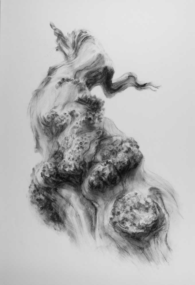
My solo exhibition at Edinburgh Palette, ‘On Tree Time’ was about the ways in which trees adapt and endure.
Although they move too slowly for us to perceive, over the span of centuries wood flows, trunks twist and limbs turn. I presented a new body of works on paper in charcoal, pastel and oil, celebrating the resilience and life force of trees.
Here’s how ‘On Tree Time’ looked in the gallery.
This exhibition brought together three strands of my work about ‘Tree Time’, a phrase coined by long time champion of ancient trees, Ted Green and one which chimes with my experience of discovering and drawing them for the last 12 years.
“When I begin to draw an ancient tree I’m struck by a powerful feeling of my being a short-lived creature amongst ancients.”
June 2021 felt like a new beginning, for me having my first solo show as a full-time artist and for all of us as a time to begin living publicly again after the hardest winter months.
After many weeks of not being able to travel to my usual woodland drawing sites and working hard in the studio, I was proud to show the results to people in person at last.
Due to the uncertainty surrounding public events and difficulties with framing supplies, I made the decision to install most of the work unframed.
Many thanks to Edinburgh Palette and its staff for their support and assistance in mounting the show.
For the last 100 days I’ve been studying light and dark in art, ‘chiaroscuro’ being the arty Italian word for this – loved by the old masters and still well used by contemporary painters, photographers and film makers. 100 is such a satisfying number and I’m surprised and delighted to have been able to keep going till the end – if you’d like to see the complete works first head here, or if you’re interested in the debrief, read on…
Some highlights
It would be hard to choose a favourite day but there were some that stick in my mind as particularly rewarding, either because of the mastery of the original artist, the way my materials behaved, or just the way the image chimed with my mood at the time. Incidentally, my favourite title of a work I copied was Joseph Wright of Derby’s ‘Two boys fighting over a bladder’ – bold!
Here are a few special ones:
An oil study from one of my photographsAfter Ken Currie’s ‘Interregnum’After a photograph of Rodin by Edward SteichenAfter Rembrandt’s ‘Bearded old man’My edited photo of flames from my firepit
What have I learned?
A dive into the art historical archives is never a waste of time – as Austin Kleon’s smashing little book ‘Steal Like an Artist’ says, artists build their practice on the work of those before them, none of us are really ‘original’. I feel quite privileged to be able to dip into artworks from the past to feed my future. Thanks for that art ancestors!
Rembrandt was indeed a master – no surprises there and I’ve always been blown away by his work. Copying it gave me an even deeper understanding of his craftmanship and humanity and was a pure pleasure at all times.
Caravaggio took it a bit too far for my liking. I realise how ridiculous this sounds and in no way dispute his mastery as a painter and of chiaroscuro in particular, but through copying I learned that the stark contrasts between light and dark in his painting was a bit too clear cut for me, I like a little more mystery, more ambiguity and softer edges.
Vermeer repeated himself – the copies I made had so many similarities in the lighting and composition which I only really noticed through drawing. I fancifully imagine that his studio had the perfect spot where the light fell in just the right way and he just positioned all his models to take advantage of that, and why not?
Early photographers, particularly those who aligned themselves with Pictorialism, creating some fantastic compositions. Some of these were amongst my favourites to copy from. I loved the emergent quality in many of them.
Ken Currie makes such intensely powerful paintings and I really enjoyed copying from them to learn how, though my very limited scale meant that this didn’t work for some.
Composition is king – the images which had the most impact even at such a small scale were the ones which were from carefully crafted compositions and tonal arrangements. The ones which were less impressive were poorly cropped, at the wrong scale or just unconsidered. I had deliberately limited myself to a 10cm (ish) square which didn’t always suit my choice of source image, but had the advantage of being quite ‘do-able’ every day.
I should devote more time to cropping and editing my own photos, to provide a rich source of imagery to draw from. In the past I’ve had a bad habit of taking photographs of visually interesting things then ignoring them in the archive, like hoarding good books but not reading them. Reviewing with a particular purpose has been really useful. Must do that more.
I am totally in love with monotone oil painting – the works I made for this project have really given me a taste for more and on a significantly bigger scale. Summer = oil painting in my studio plan!
Things to take forward
In terms of my own art, above all I’ve learned about what excites me visually and what I want to continue to pursue. Emerging forms, dark ambiguity, subtle gradation, strong composition and tonal arrangement and a monochrome palette are all part of the recipe for future work.
The daily practice was sometimes a struggle for such a lengthy period, but I’m more likely now to embark on another long term project than I thought in January. It’s so good to see other people’s projects and follow their journeys, and sharing online definitely helps to keep up the motivation. If you’re thinking of giving it a go yourself, I’d highly recommend it – here’s the project page to help you on your way.
Read how the project started here, view the full gallery here or check out my weekly project updates on Instagram.
I’ll be having a real-life, on the wall exhibition this June at Edinburgh Palette, my former studio complex and creative home in the east of Edinburgh – how exciting!!!
‘On Tree Time’ explores the way trees adapt and endure in the face of adversity. It will feature a selection of new works on paper in charcoal, oil and pastel made during winter and spring 2020-21. The show opens Friday 4th June and closes on Sunday the 20th, so that’s 16 whole days where anyone who can travel to the area can come to see my newest work in person, have a proper chat with me and maybe even choose a piece for their own collection.
So much has changed over the last year that planning this exhibition feels almost like starting from scratch, even though I’ve been doing them for 10 years now. Private views and opening parties will need to be different, open door visiting may not be possible and hugs with friends, followers and colleagues will sadly be missing.
Some things will be the same though. For visitors, there’s the chance to get up close and personal with the art, to peer at the details as well as take in the whole view, to get a true sense of the textures, colours and energy of the work. For me, I relish the opportunity to show a collection of work with a coherent theme all together, the chance to talk about the story of the work with visitors, choosing favourites and great combinations, noticing rhymes and echoes, contrasts and creative leaps. Sitting with my exhibitions has always been a favourite time for me to reflect on that body of work, review its successes and where it has fallen short of the idea. Almost always I come out of that process with new ideas sparked.
One of the things that I like many creative people have missed so much is encountering the random, unexpected or surprising which can so often be the stimulus for new ideas. Alongside travelling to distant woodlands, it’s conversations with people not in my ‘bubble’ that I’ve missed the most. I’m so looking forward to talking to visitors about their experiences of trees and art, their knowledge and perspectives are always creatively energising.
To try and make the best of the current limitations, I’m putting together a programme of online and in person events linked to the exhibition so, if you’d like to hear about these and be first to get tickets, make sure you are subscribed to my Studio Newsletter. Find out how you can visit here and I hope to be showing you my new drawings very soon.
In the gloomy and restricted days of lockdown this January, I heard about the 100 day project on a podcast and decided that if there was ever a time to start a daily practice it was now. I set out to investigate how past artists have used light and dark to create drama and I did not think I was disciplined enough to keep going, but it turns out that I am more averse to failure than sticking to a routine! (Read about the background to my project here)
Here’s a selection from the first 50 days. Most of the works are around 10 x 10cm on paper or card. I’ve played with lots of the dry media hanging around my studio – charcoal, graphite, sanguine, sepia, pastel, conté and I’ve also made some little oil studies of real and imagined trees using the wipe-out technique (after Carriere).
Here’s hoping I can make it to 100 – it’s definitely getting harder now the evenings are light and travel and social restrictions have eased but I’m enjoying it too much to give up now.
You can view the gallery of the full 100 days here and check out my weekly posts on Instagram or Facebook.
It’s no secret that artists absolutely love getting new art materials, regardless of whether we actually need any or not. In fact need has nothing to do with it. I think this collecting habit is driven by curiosity – what if that new brush is exactly what I’ve been searching for, maybe that new pastel is the perfect green for those mossy bits, perhaps that ink will make exciting splashy marks I’d never imagined possible?
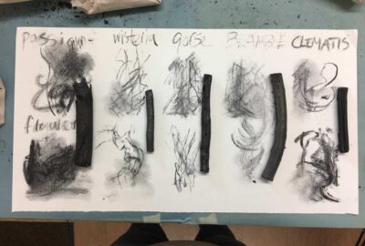
In this spirit of discovery, I jumped at the chance to try some unusual types of charcoal when I came across Wildwood Charcoal showing their experiments on Instagram.
I usually use charcoal from art materials suppliers, mostly made by Coates and Nitram for sticks and Derwent for the powder. I’ve not been too fond of homemade charcoal for drawing before, as it’s been very unpredictable, pale and quite frustrating to draw with. However, I heard from another artist that the passionflower one was great to work with so I ordered a little sample pack and got to work on some arty experiments.
My exciting little package arrived nestled beautifully in sweet smelling straw, wrapped in carefully labelled paper – nice touch! I set to work testing them in a not very methodical way, just allowed the marks to flow as the charcoals suggested.
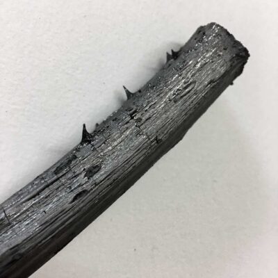
Passionflower was indeed a delight, luscious and black. Gorse on the other hand was scratchy and grey, but in an interesting way. Clematis was definitely a favourite for its depth of tone but also its texture – the outer layers being ridged and slightly crumbly, giving pleasantly surprising results. Wisteria had less personality and bramble (pictured above) was pretty brutal – the thorns still jaggy even after carbonising and the stem so hard it seemed almost metallic.
I came to the conclusion that passionflower and clematis would be a great addition to my charcoal ‘palette’, gorse would be worth further exploration and bramble would be excellent if I ever wanted to draw on a stone wall. Each species had its own distinct character which produced a drawing style particular to it. I’d love explore this further, working on more sustained drawings. Of course I’ve also got a list of other plants I’d like to try now – I’ve got a feeling that’s the first of many little Wildwood charcoal packages arriving in my studio.
I’m delighted to be this month’s featured artist in the beautiful publication Herbology News. Have a look here for a thoughtful and inspiring read with a deep connection to nature. Thanks to Editor Kyra for inviting me and to the design team for showing my work so beautifully alongside the articles. On the cover is ‘Cascade’ from my new ‘Rivers of oak’ series of charcoals.
We use cookies to ensure that we give you the best experience on our website. If you continue to use this site we will assume that you are happy with it.OKPrivacy policy


 It also means I get to paint with my fingers, so I’m still in that particular comfort zone! Guiding me on the studio wall are images of lithographs by
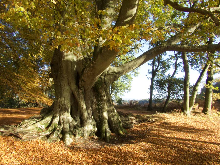
 Inside the artist’s studio
 We artists are very adaptable, so in response to the restrictions in place during the exhibition I found some new ways to take the art to people who couldn’t be there in person.


 ‘On Tree Time’ explores the way trees adapt and endure in the face of adversity. It will feature a selection of new works on paper in charcoal, oil and pastel made during winter and spring 2020-21. The show opens Friday 4th June and closes on Sunday the 20th, so that’s 16 whole days where anyone who can travel to the area can come to see my newest work in person, have a proper chat with me and maybe even choose a piece for their own collection.
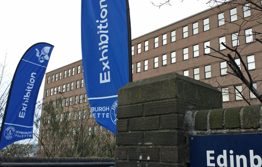


 You can view the gallery of the full 100 days
 My exciting little package arrived nestled beautifully in sweet smelling straw, wrapped in carefully labelled paper – nice touch! I set to work testing them in a not very methodical way, just allowed the marks to flow as the charcoals suggested.